The Ink & Switch Dispatch
Keep up-to-date with the lab's latest findings, appearances, and happenings by subscribing to our newsletter. For a sneak peek, browse the archive.
2024 Feb 23
Whenever reviewing changes to a document, it’s essential to have a way of seeing what changed: a “diff view.”
Diff views appear in source control tools, such as the red/green line-based view in the diff unix utility. Writers have seen the blue (added) and red+strikethrough (removed) syntax found in word processors.
But two common problems we’ve noticed ourselves and heard from others about existing diff views for prose:
Here are some small experiments we tried in this area to improve legibility and utility.
First, diff visualization in the full-size document editor:

We also used the right-side gutter, traditionally used for comments, to call out additions and deletions. Most promising here was showing replaced text, which is a common operation in copyediting but can get noisy with strikethrough-based diff views.

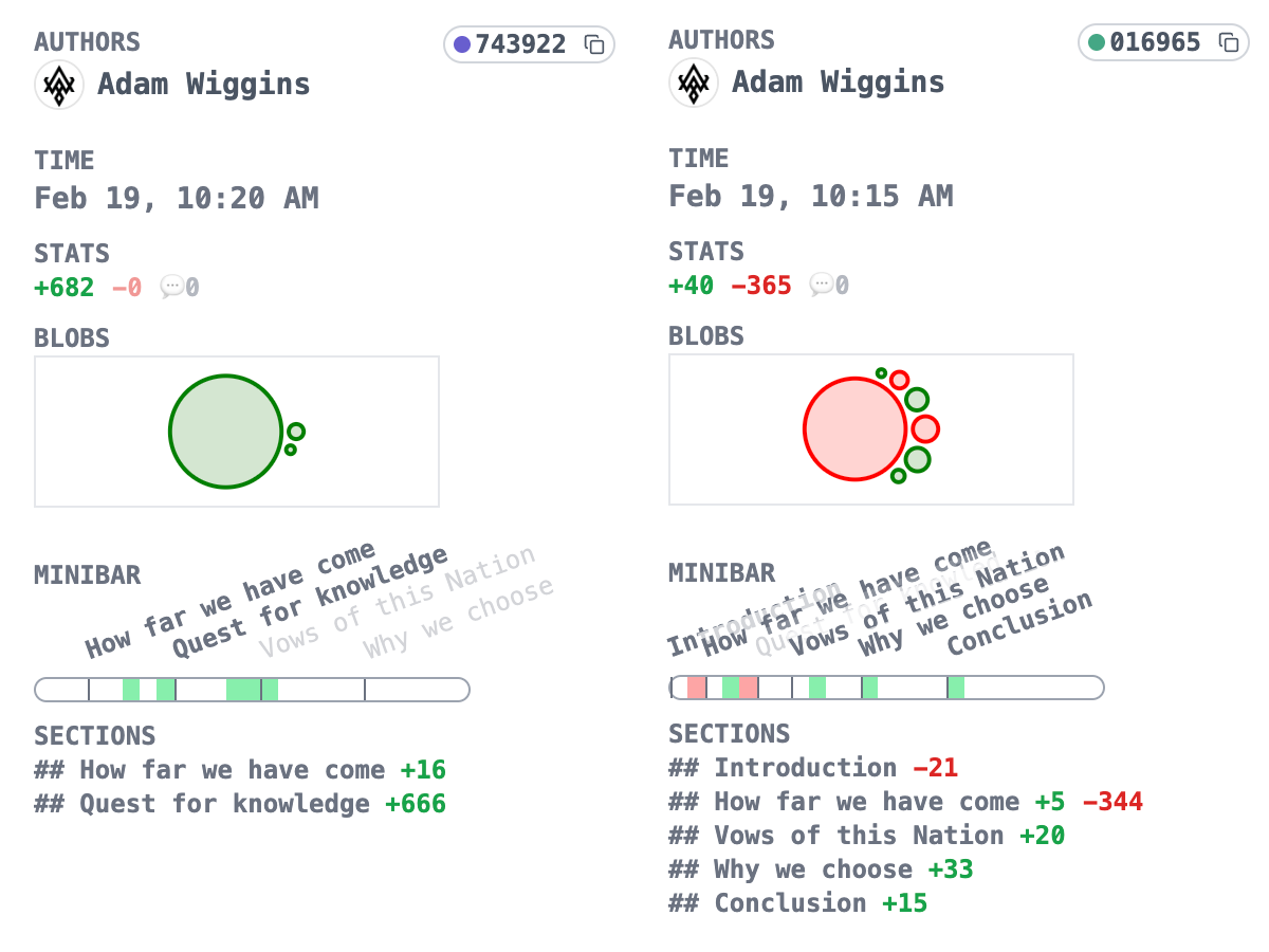
There’s another type of diff visualization we need, which is a summary or thumbnail view. Git shows a commit summary in the style of “+added/-removed,” but no such thing exists for prose writing.
Some experiments we tried for a summary diff:
 Breaking these down top to bottom:
Our team’s favorites so far are the hover-to-show-deleted (full document) and the minibar (summary). What directions do you think we should try next?